The Power of Colors in Digital Marketing:
Colors play a significant role in our everyday lives, influencing our emotions, decisions, and perceptions. In the realm of digital marketing, understanding the psychology of colors can give businesses a strategic advantage. This blog explores how different colors impact consumer behavior and how you can leverage this knowledge to enhance your digital marketing efforts.
The Basics of Color Psychology

What is Color Psychology?
Color psychology is the study of how colors affect human behavior and emotions. It is a crucial aspect of branding and marketing as colors can evoke specific feelings and associations. For instance, red often signifies passion or urgency, while blue tends to evoke calmness and trust.
How Colors Influence Perception:
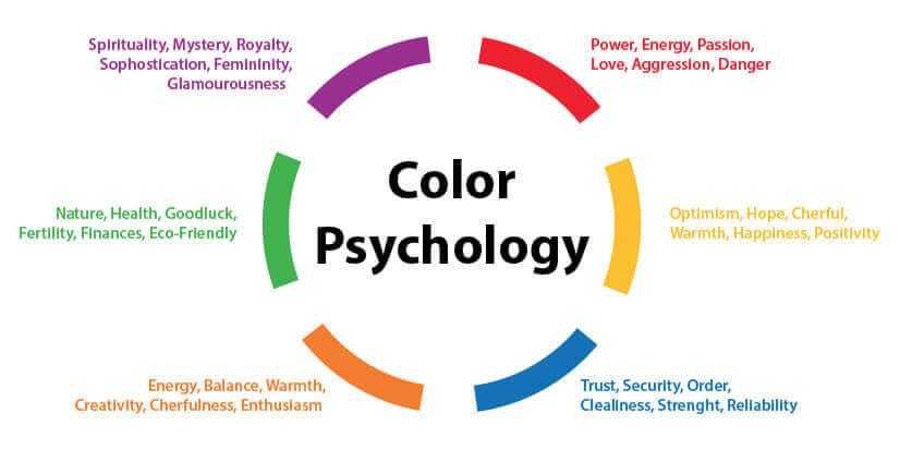
Different colors can trigger different responses. For example, warm colors like red, orange, and yellow can evoke feelings of warmth and excitement, whereas cool colors like blue, green, and purple can induce feelings of calmness and serenity. Understanding these associations helps marketers create content that resonates with their target audience.
Colors and Their Psychological Effects
:max_bytes(150000):strip_icc()/KaterynaKovarzh-1ba05508b85442b499a1ac2a9e324e8b.jpg)
Red: Urgency and Passion:
Red is a powerful color often associated with passion, energy, and urgency. It is commonly used in call-to-action buttons and sales promotions to create a sense of urgency and encourage quick decisions. Brands like Coca-Cola and Netflix use red to grab attention and evoke strong emotions.
Blue: Trust and Calmness
Blue is associated with trust, calmness, and professionalism. It is a popular choice for financial institutions, healthcare providers, and tech companies. Brands like Facebook, Twitter, and LinkedIn use blue to convey reliability and trustworthiness, making it easier for consumers to feel secure when engaging with their services.
Yellow: Optimism and Happiness
Yellow represents optimism, happiness, and warmth. It is often used to attract attention and evoke positive feelings. Brands like McDonald’s and IKEA use yellow to create a cheerful and inviting atmosphere, encouraging customers to feel happy and comfortable.
Green: Health and Tranquility
Green symbolizes health, tranquility, and nature. It is frequently used by brands that promote wellness, sustainability, and eco-friendliness. Companies like Whole Foods and Spotify use green to emphasize their connection to nature and well-being, creating a sense of balance and harmony.
Purple: Luxury and Creativity
Purple is associated with luxury, creativity, and sophistication. It is often used by brands that want to convey a sense of elegance and exclusivity. Companies like Cadbury and Hallmark use purple to highlight their premium products and creative endeavors, appealing to consumers seeking high-quality and unique experiences.
Orange: Energy and Enthusiasm
Orange represents energy, enthusiasm, and excitement. It is a dynamic color that can stimulate action and confidence. Brands like Amazon and Fanta use orange to create a vibrant and energetic vibe, encouraging consumers to feel enthusiastic about their products and services.
Black: Power and Sophistication
Black signifies power, sophistication, and elegance. It is often used by luxury brands and high-end products to convey a sense of exclusivity and authority. Companies like Chanel and Nike use black to emphasize their premium quality and sophisticated image.
Applying Color Psychology in Digital Marketing

Choosing the Right Colors for Your Brand:
When selecting colors for your brand, consider the emotions and associations you want to evoke in your audience. Your color choices should align with your brand values and the message you want to convey. Conducting market research and understanding your target audience can help you make informed decisions about your color palette.
Creating Effective Call-to-Action Buttons:
Colors can significantly impact the effectiveness of your call-to-action (CTA) buttons. For instance, using a bold color like red or orange can create a sense of urgency and prompt users to take immediate action. Ensure that your CTA buttons stand out from the rest of your content to attract attention and drive conversions.
Enhancing User Experience with Colors:
Colors can enhance the overall user experience on your website or digital platform. Use colors to create a visually appealing and cohesive design that guides users through your content. Avoid using too many contrasting colors, as this can be overwhelming. Instead, opt for a balanced and harmonious color scheme that reflects your brand identity.
Harnessing the Power of Colors in Digital Marketing:
Understanding the psychology of colors is essential for creating effective digital marketing strategies. By leveraging the emotional and psychological effects of colors, you can enhance your brand’s appeal, improve user experience, and drive better engagement with your audience. Experiment with different colors and monitor their impact on your marketing efforts to find the perfect color palette for your brand.

